A self promotional holiday gift box created for Edward Enterprises to showcase the company’s printing and production capabilities
Packaging
Illustration

Project Overview
OVERVIEW
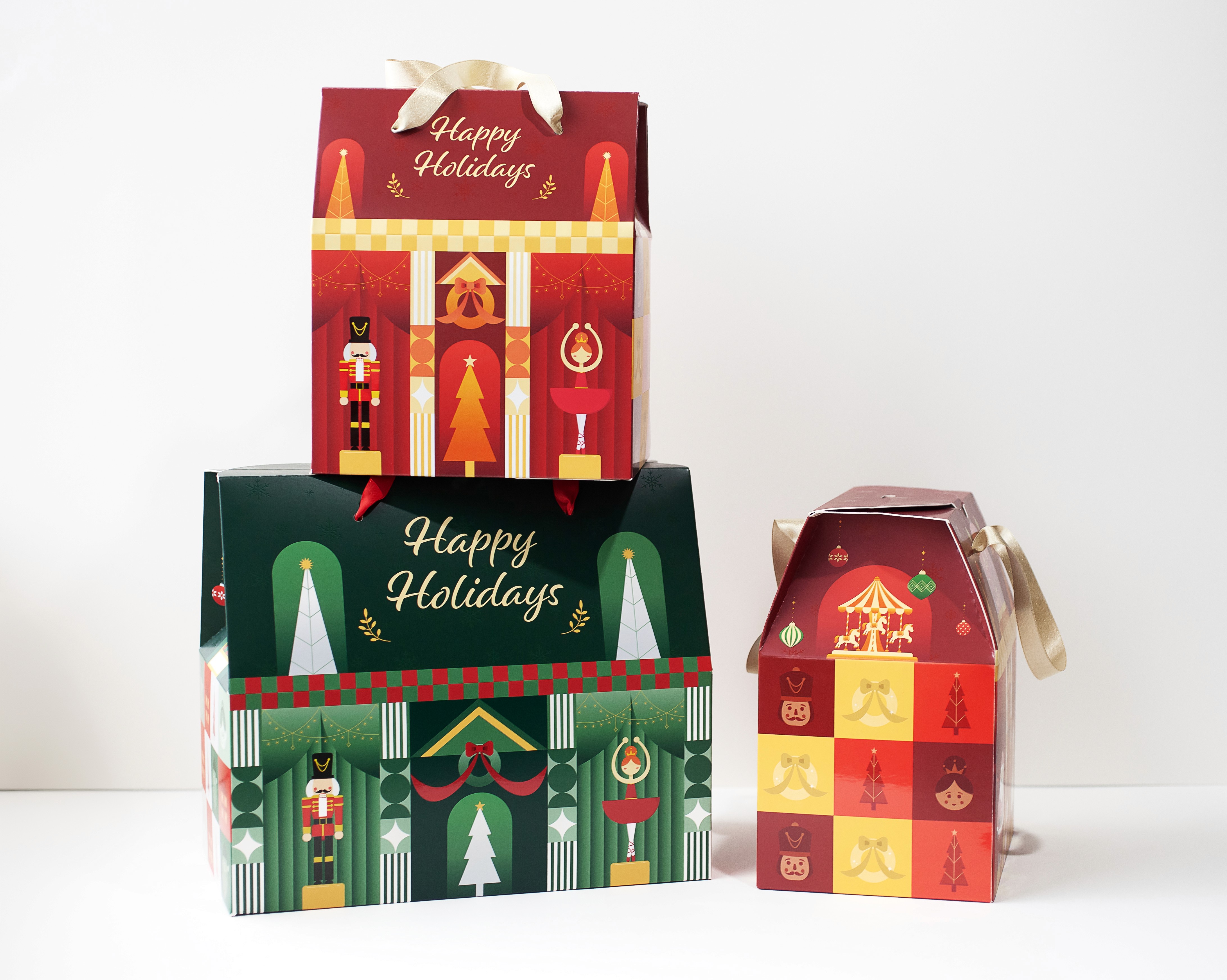
A collaborative packaging design for a seasonal holiday box, developed as part of a team project.
DELIVERABLES
2 Different Size Boxes
PROBLEM
Edward Enterprises needed a holiday gift box that would:
Stand out to clients
Demonstrate print and production capabilities
Deliver a cohesive and memorable brand experience
The challenge was to balance visual appeal, brand identity, and print feasibility within production constraints.
MY ROLE: GRAPHIC DESIGNER
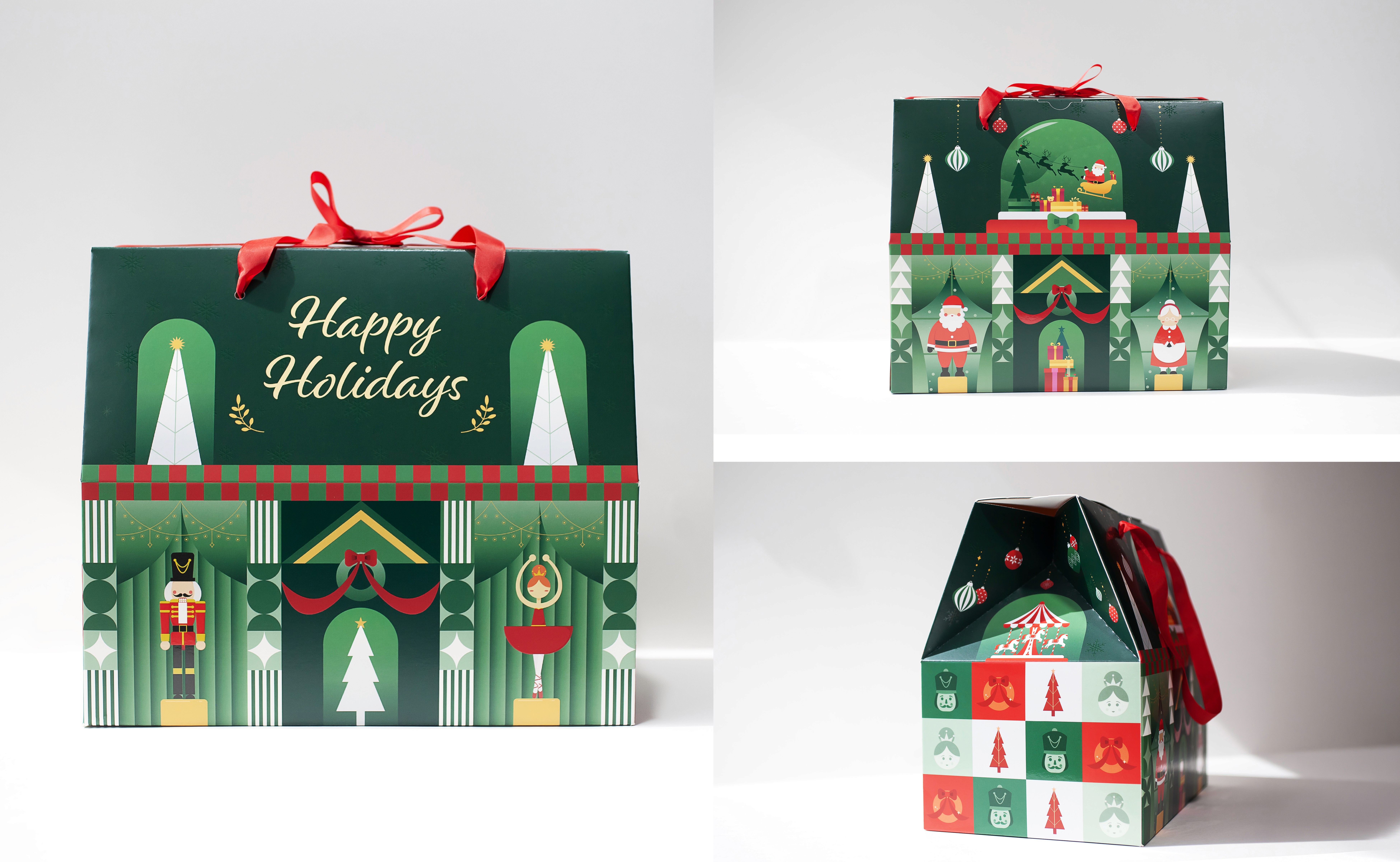
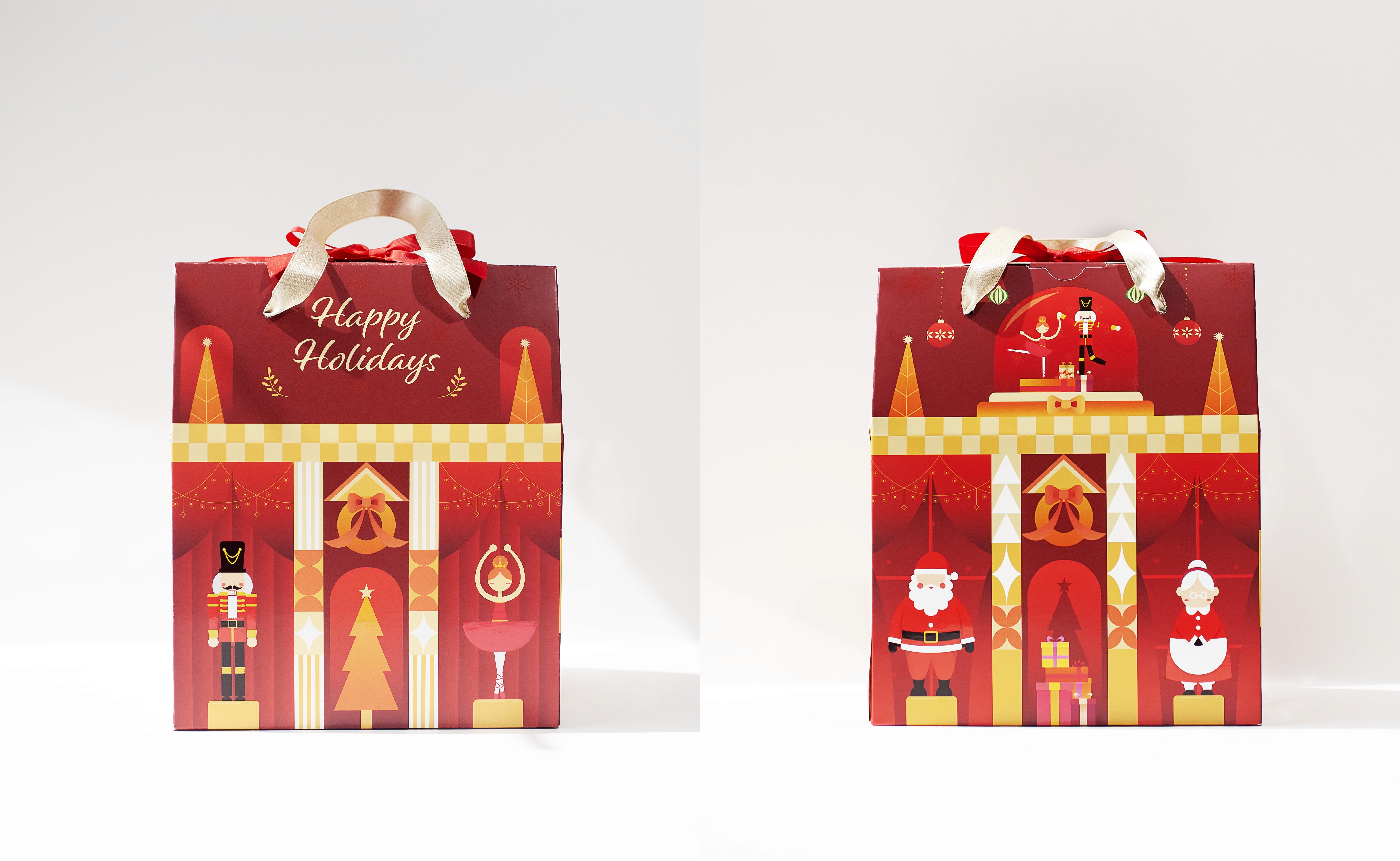
Designed a custom pattern for the side panels, ensuring visual consistency across the packaging, and contributed to multiple top panel designs that extend the narrative of the main illustrations.
Process
CONCEPT DEVELOPMENT
Our team explored incorporating recognizable Christmas characters into the main box design, ultimately choosing an abstract, modern illustration style to balance the company’s long standing reliability with a sense of personality.
EXECUTION
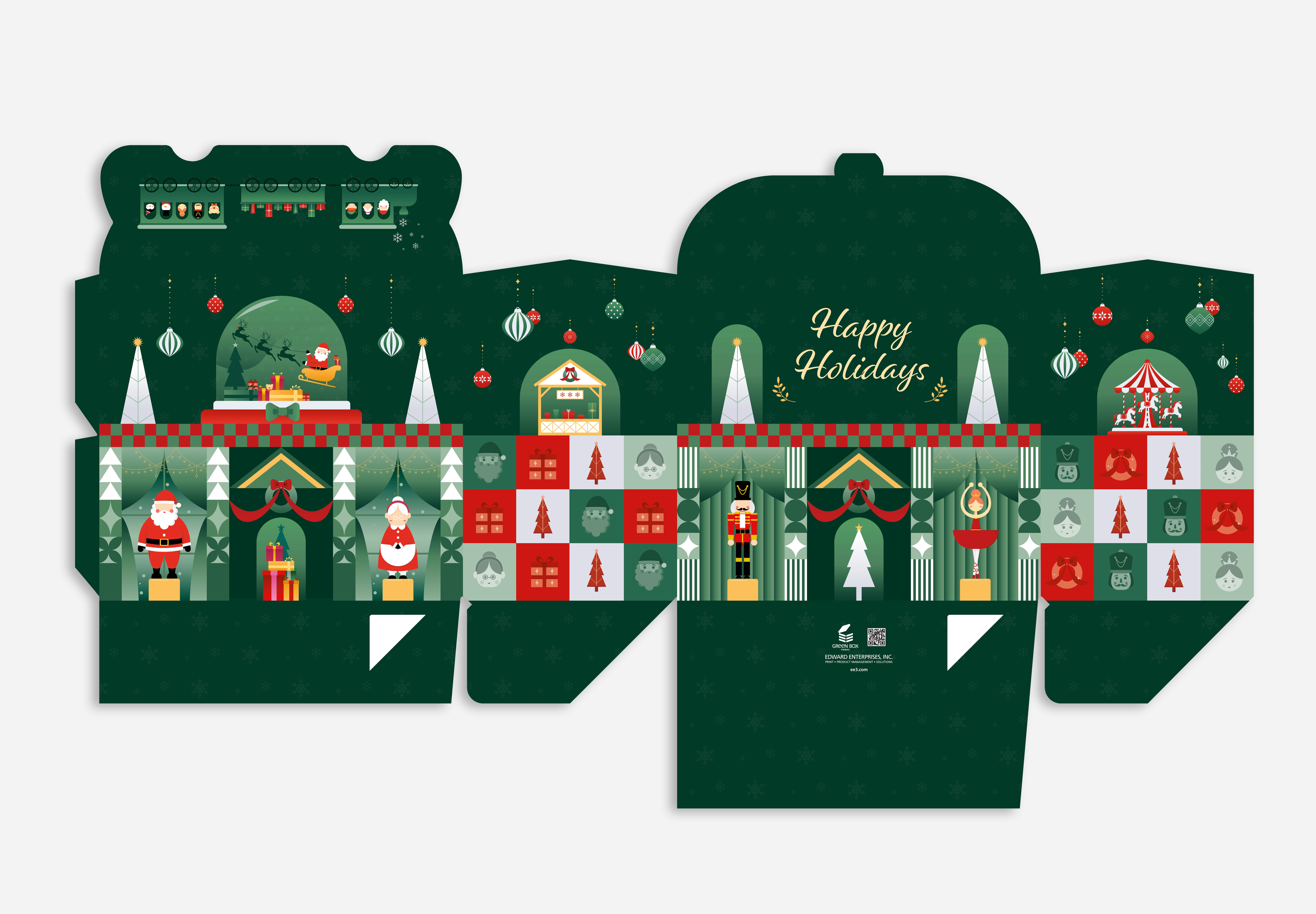
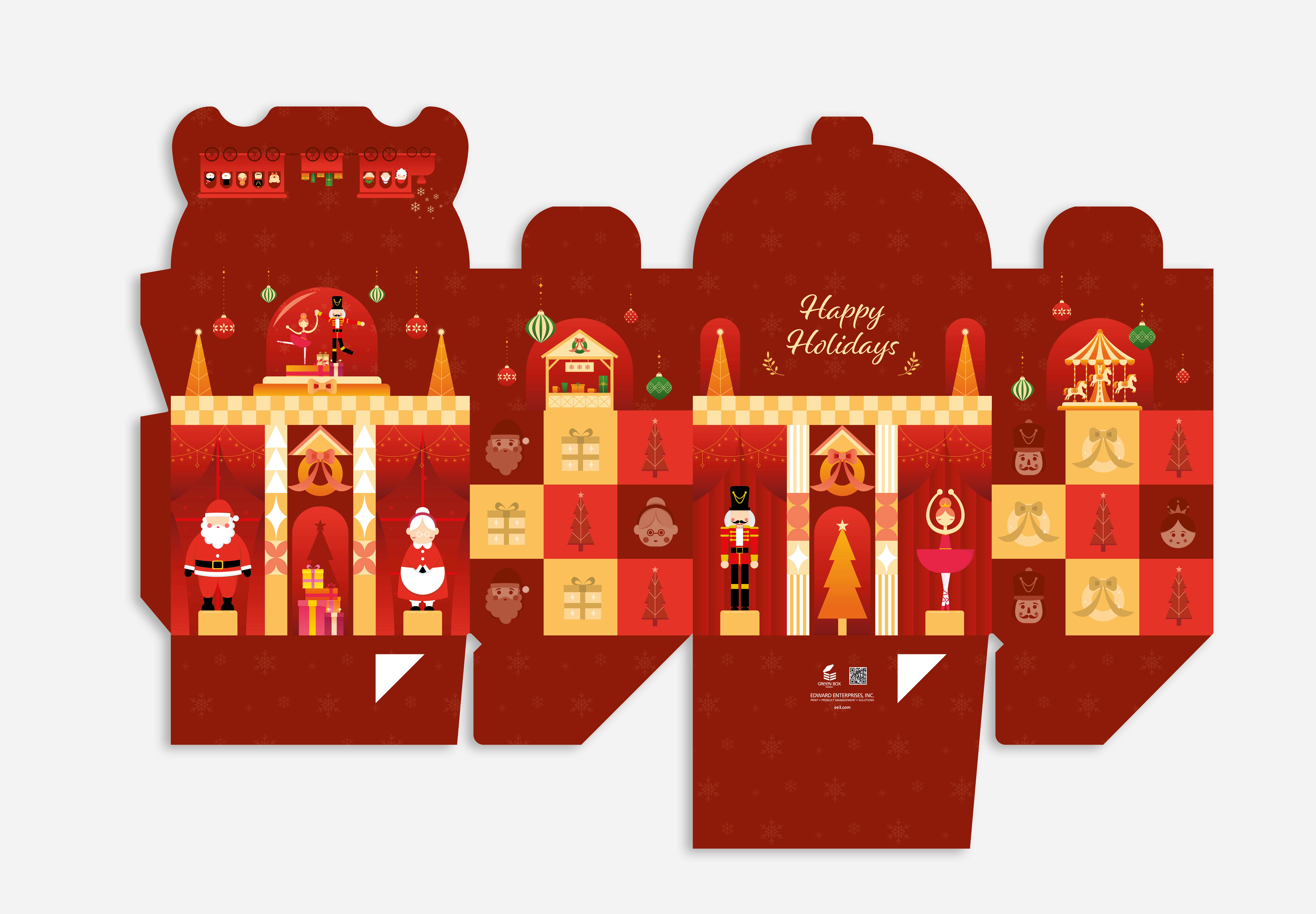
To maintain visual consistency, I developed a simplified pattern derived from the core visual elements and applied it across the side panels. I introduced additional details to enhance visual interest while keeping the design cohesive.


EXECUTION
I designed the back top panels for both boxes, developing complementary scenes that extend the established visual narrative. The green box features a Santa sleigh scene within a snow globe, while the red box reinterprets the Sugar Plum Fairy and Nutcracker in motion. These additions reinforce continuity and deepen the storytelling across the packaging system.

Printing
SPECIAL FINISHES
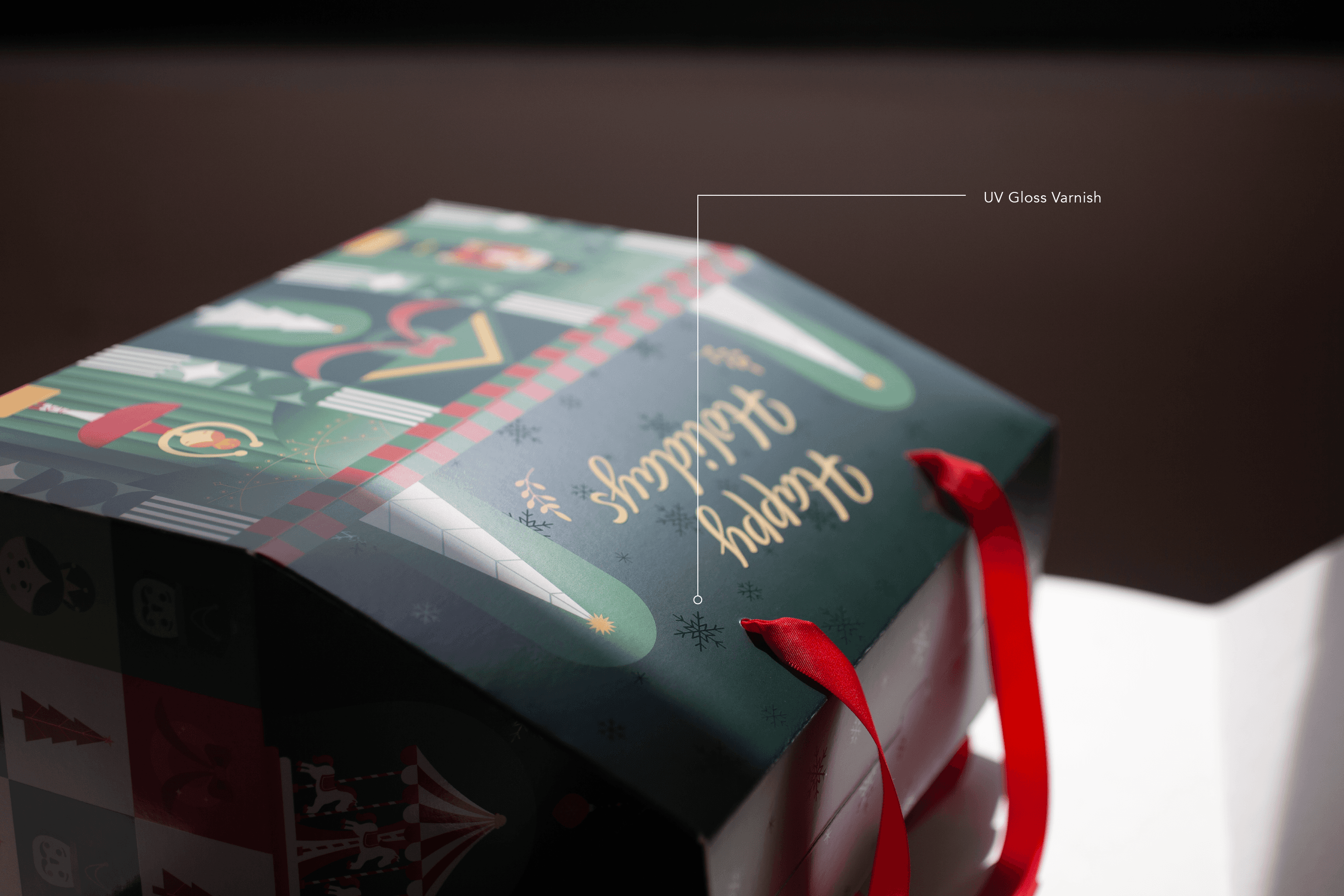
To enhance the final packaging, we utilized on-press varnish techniques to elevate key design elements.
A UV gloss varnish was applied to the main illustrations to create contrast and emphasis
A UV dull flood was used across the remaining surfaces to achieve a matte finish.
This combination added visual depth and hierarchy while improving durability, resulting in a more water-resistant and long-lasting product.
Solution & Outcome
A cohesive packaging system that integrates illustration, pattern design, and narrative elements across multiple panels. The final product was used for client outreach, showcasing Edward Enterprises’ printing and production capabilities.
" height="15.093399999999999px" id="TcVBdGAML" transform="translate(3.5 1)" width="18px"/><path d="M 1.103 0.086 C 1.136 0.109 1.162 0.135 1.182 0.164 C 1.284 0.313 1.209 0.528 0.982 0.686 C 0.711 0.876 0.327 0.914 0.123 0.772 C 0.09 0.749 0.064 0.722 0.044 0.694 C -0.057 0.545 0.018 0.33 0.245 0.171 C 0.516 -0.018 0.9 -0.056 1.103 0.086 Z" fill="rgb(219, 29, 0)" height="1px" id="XB9sHV6XO" transform="translate(13.038 10.299)" width="1.2268513404660126px"/><path d="M 1.103 0.086 C 1.136 0.109 1.162 0.135 1.182 0.164 C 1.284 0.313 1.209 0.528 0.982 0.686 C 0.711 0.876 0.326 0.914 0.123 0.772 C 0.09 0.749 0.064 0.722 0.045 0.694 C -0.057 0.545 0.018 0.33 0.245 0.171 C 0.515 -0.018 0.9 -0.056 1.103 0.086 Z" fill="rgb(219, 29, 0)" height="1px" id="L22u6owDv" transform="translate(11.631 9.787)" width="1.2266147736854904px"/><path d="M 1.104 0.086 C 1.136 0.109 1.163 0.135 1.182 0.164 C 1.284 0.313 1.209 0.528 0.982 0.686 C 0.711 0.876 0.327 0.914 0.123 0.772 C 0.09 0.749 0.064 0.722 0.045 0.694 C -0.057 0.545 0.018 0.33 0.245 0.171 C 0.516 -0.018 0.9 -0.056 1.104 0.086 Z" fill="rgb(219, 29, 0)" height="1px" id="f0gDmi85_" transform="translate(14.265 9.441)" width="1.2269392586073167px"/><path d="M 1.104 0.086 C 1.137 0.109 1.163 0.135 1.182 0.164 C 1.284 0.313 1.209 0.528 0.982 0.686 C 0.711 0.876 0.327 0.914 0.123 0.772 C 0.09 0.749 0.064 0.722 0.045 0.693 C -0.057 0.544 0.018 0.33 0.245 0.171 C 0.516 -0.018 0.9 -0.056 1.104 0.086 Z" fill="rgb(219, 29, 0)" height="1px" id="XRmJgJI3i" transform="translate(12.858 8.93)" width="1.2269392586073025px"/><path d="M 1.104 0.086 C 1.137 0.109 1.163 0.135 1.182 0.164 C 1.284 0.313 1.209 0.528 0.982 0.686 C 0.711 0.876 0.327 0.914 0.123 0.772 C 0.091 0.749 0.064 0.722 0.045 0.694 C -0.057 0.545 0.018 0.33 0.245 0.171 C 0.516 -0.018 0.9 -0.056 1.104 0.086 Z" fill="rgb(219, 29, 0)" height="1px" id="wsCLkGZ6y" transform="translate(15.492 8.583)" width="1.2268689103426667px"/><path d="M 1.104 0.086 C 1.136 0.109 1.163 0.135 1.182 0.164 C 1.284 0.313 1.209 0.528 0.982 0.687 C 0.711 0.876 0.327 0.914 0.123 0.772 C 0.09 0.749 0.064 0.722 0.045 0.694 C -0.057 0.545 0.018 0.33 0.245 0.171 C 0.516 -0.018 0.9 -0.056 1.104 0.086 Z" fill="rgb(219, 29, 0)" height="1px" id="UqTGtjMla" transform="translate(14.085 8.072)" width="1.2269055199070777px"/><path d="M 1.104 0.086 C 1.137 0.109 1.163 0.135 1.182 0.164 C 1.284 0.313 1.209 0.528 0.982 0.686 C 0.711 0.876 0.327 0.914 0.123 0.772 C 0.09 0.749 0.064 0.722 0.045 0.694 C -0.057 0.545 0.018 0.33 0.245 0.171 C 0.516 -0.018 0.9 -0.056 1.104 0.086 Z" fill="rgb(219, 29, 0)" height="1px" id="RaGfd1gJR" transform="translate(16.719 7.726)" width="1.2268147736854758px"/><path d="M 1.104 0.086 C 1.137 0.109 1.163 0.135 1.182 0.164 C 1.284 0.313 1.209 0.528 0.982 0.687 C 0.711 0.876 0.327 0.914 0.123 0.772 C 0.09 0.749 0.064 0.722 0.045 0.694 C -0.057 0.545 0.018 0.33 0.245 0.171 C 0.516 -0.018 0.9 -0.056 1.104 0.086 Z" fill="rgb(219, 29, 0)" height="1px" id="gI39y_TTg" transform="translate(15.311 7.214)" width="1.22674442542084px"/><path d="M 1.104 0.086 C 1.136 0.109 1.163 0.135 1.182 0.164 C 1.284 0.313 1.209 0.528 0.982 0.687 C 0.711 0.876 0.327 0.914 0.123 0.772 C 0.09 0.749 0.064 0.722 0.044 0.694 C -0.057 0.545 0.018 0.33 0.245 0.171 C 0.516 -0.018 0.9 -0.056 1.104 0.086 Z" fill="rgb(219, 29, 0)" height="1px" id="B6pvGR_Wl" transform="translate(17.946 6.868)" width="1.2268147736854758px"/><path d="M 1.104 0.086 C 1.136 0.109 1.163 0.135 1.182 0.164 C 1.284 0.313 1.209 0.528 0.982 0.686 C 0.711 0.876 0.327 0.914 0.123 0.772 C 0.09 0.749 0.064 0.722 0.045 0.694 C -0.057 0.545 0.018 0.33 0.245 0.171 C 0.516 -0.018 0.9 -0.056 1.104 0.086 Z" fill="rgb(219, 29, 0)" height="1px" id="bbeGa4AZ4" transform="translate(16.538 6.357)" width="1.2268147736854687px"/><path d="M 2.917 0.02 C 2.566 0.148 2.205 0.26 1.867 0.419 C 1.367 0.654 0.921 1.047 0.576 1.474 C 0.262 1.863 -0.006 2.338 0 2.852 C 0.006 3.389 0.4 3.737 0.865 3.925 C 1.522 4.191 2.353 4.166 3.045 4.112 C 3.825 4.051 4.592 3.871 5.304 3.546 C 6.661 2.924 8.101 2.211 9.628 2.175 C 9.927 2.168 10.389 2.207 10.537 2.424 C 10.705 2.671 10.516 2.887 10.263 3.014 C 9.857 3.219 9.408 3.321 9.009 3.548 C 8.488 3.844 8.139 4.325 7.991 4.902 C 7.893 5.285 8.484 5.447 8.582 5.065 C 8.858 3.99 9.866 3.95 10.688 3.481 C 11.4 3.075 11.355 2.058 10.602 1.728 C 10.181 1.542 9.702 1.542 9.251 1.585 C 8.571 1.651 7.906 1.833 7.26 2.052 C 6.417 2.337 5.642 2.755 4.822 3.092 C 4.081 3.396 3.267 3.515 2.471 3.525 C 1.936 3.532 1.115 3.546 0.716 3.123 C 0.439 2.831 0.734 2.318 0.904 2.056 C 1.188 1.618 1.612 1.257 2.066 1.004 C 2.381 0.829 2.742 0.733 3.08 0.61 C 3.448 0.476 3.289 -0.116 2.917 0.02 Z" fill="rgb(219, 29, 0)" height="5.282784710833035px" id="jfAGWIIWN" transform="translate(7.811 13.717)" width="11.195729794649612px"/></svg>)